1)What are the key conventions that help you identify the print text (e.g. title, central image, review quotes etc.)?
- there are secondary images to further give an idea of what is in the film. Film reviews, the title of the film at the front and on the side. The central image is the same as the CD cover. The names of the actors and the director Plan B. A basic outline of what to expect in the film.
2)What design features help identify the Ill Manors brand?
- The black, grey, white and red colour scheme. Plan b on the front cover, Screengrabs of the actors at from the film itself. Plan B's logo on the 'i' of ill manors. Plan B smoking which emphasises the rebellious youth in a council estate.
3)What examples of synergy can you find with the broadcast platform or other print examples?
- The same picture is used on the CD cover as ell as on the dvd cover. The same font for ill manors title which is the same on the other print text

1)What are the key conventions that help you identify the print text (e.g. title, central image, review quotes etc.)?
2)What design features help identify the Ill Manors brand?
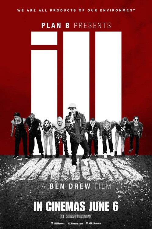
- The title of the film is the same used in all the products that are there to promote the film. The colour scheme is similar to other print designs, however in this poster red is the main colour that is used when it is usually isn't.
- Title of the film, the 'ill' being placed in the middle as if it was the blocks of an estate building. and the 'manors' placed underneath. There is a main focus of the image is Riz Ahmed character with the rest of the other characters in the narrative placed behind. There is also the release date with the age rating 18 and social media links at the bottom of the poster. The directors name is also placed underneath the title, both his real name and stage name as an artist. The tagline is also placed at the top of the poster and there is a colour scheme of white, grey and red.
- The title of the film is the same used in all the products that are there to promote the film. The colour scheme is similar to other print designs, however in this poster red is the main colour that is used when it is usually isn't.
3)What examples of synergy can you find with the broadcast platform or other print examples?
- The actors on the poster is the same as in the film and other print design. The name of the director Ben drew and his stage name Plan B. BBFC age rating. The tagline of the film is also mentioned at the beginning of the film itself.

1)What are the key conventions that help you identify the print text (e.g. title, central image, review quotes etc.)?
- The title is placed in the middle of the CD cover as well as the central image. There is also The logo of the artist that has their name written in it. There is a parental advisory warning which is used when the content is explicit. The colour scheme is all black, greys and white, With the red for the artist logo.
2)What design features help identify the Ill Manors brand?
- The title of the CD is the same for the title of the film, especially the font and the fact that that the 'i' in Ill Manors is lowercase in this as well.
- The title of the CD is the same for the title of the film, especially the font and the fact that that the 'i' in Ill Manors is lowercase in this as well.
3)What examples of synergy can you find with the broadcast platform or other print examples?
- The font used for the title of the film is the same on the CD. The location in the background is the same as the dvd case. The colour scheme is also the same throughout.
No comments:
Post a Comment